Quick Answer
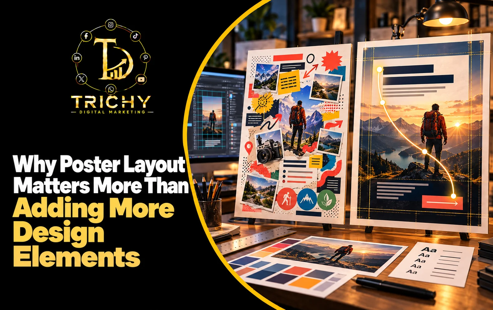
Poster layout matters because viewers understand a poster through visual order before they process every design element. A strong arrangement guides attention from the main message to supporting information and finally to the action. Adding more icons, colours, images, or text without improving structure can make a poster harder to understand.
Introduction
A poster can contain an attractive image, impressive typography, multiple icons, colourful backgrounds, promotional text, contact details, and several design effects, yet still fail to communicate effectively. The problem is often not the individual elements but the way those elements are arranged. People do not examine a poster in the same order that a designer creates it; they scan, notice visual signals, identify what appears important, and decide within seconds whether the message deserves attention. This makes layout one of the most important parts of visual communication. A well-planned arrangement creates a natural viewing path, separates important information from supporting details, and prevents the design from feeling crowded. For businesses using posters for promotions, announcements, offers, events, or brand communication, understanding layout can produce a stronger result than simply adding more visual decoration.
What Are Poster Layout Principles and Why Do They Matter?
Poster layout principles are the rules used to organise text, images, shapes, colours, spacing, and calls to action within a defined visual area.
The purpose is not simply to make everything look aligned. A good layout determines what people notice first, what they understand next, and where their attention ends.
Consider a promotional poster containing:
-
A headline
-
A product photograph
-
An offer
-
Three service highlights
-
A phone number
-
A logo
-
Social media details
If all seven elements receive similar visual importance, the viewer has to decide where to start.
A stronger arrangement establishes a hierarchy:
Main message → Supporting visual → Important benefit → Offer or detail → Action
This reduces the amount of mental effort required to understand the poster.
Layout therefore works as a silent communication system. Before a viewer consciously reads the content, the arrangement is already telling them what deserves attention.
Key Factors That Shape a Strong Poster Layout
Visual Hierarchy
Visual hierarchy determines the order in which information attracts attention.
Size, position, contrast, typography, and surrounding space can all influence importance. The primary message should normally have stronger visual presence than secondary information.
For example, a restaurant promotion might prioritise:
Weekend Offer
↓
Food Image
↓
Offer Details
↓
Call to Action
This is more effective than making the logo, headline, price, and contact number equally dominant.
Alignment
Alignment creates visual relationships between different elements.
When headings, paragraphs, images, buttons, and supporting information follow a consistent alignment system, the poster feels intentional rather than randomly assembled.
Alignment can be left-based, centred, asymmetrical, or structured around a grid, depending on the creative direction.
Proportion
Not every element deserves the same amount of visual space.
A headline may need significantly more area than a disclaimer. A product photograph may need more prominence than a secondary feature. Proportion helps communicate this difference without requiring additional words.
Contrast
Contrast separates elements that need to stand apart.
It can be created through differences in size, weight, colour, shape, brightness, or positioning. Used carefully, contrast helps the viewer identify important information quickly.
Grouping
Related information should appear visually connected.
For example, a price, discount percentage, and offer duration can be grouped together instead of being distributed across the poster. This makes the information easier to interpret as one unit.
Main Strategies for Effective Poster Arrangement
Start With the Message, Not the Decoration
Before selecting icons, effects, patterns, or decorative graphics, identify the single most important message.
Ask:
“If the viewer remembers only one thing from this poster, what should it be?”
That answer should influence the dominant area of the layout.
Create a Viewing Path
A strong poster should provide a natural route through the information.
A simple structure can be:
Attention → Meaning → Supporting Information → Action
For example, a digital marketing campaign poster could move from:
Grow Your Business Online
to
SEO + Social Media + Paid Advertising
to
Talk to Our Team
The viewer does not have to search around the design to understand the message.
Use Zones Instead of Filling Every Area
Divide the poster mentally into functional zones.
A typical promotional design may have:
|
Zone |
Purpose |
|
Top |
Brand or campaign context |
|
Upper-middle |
Main headline |
|
Centre |
Main visual or offer |
|
Lower-middle |
Supporting information |
|
Bottom |
CTA and contact information |
These zones do not need visible borders. They simply provide structure while designing.
Give Important Content More Breathing Room
When an important message is surrounded by sufficient empty space, it can become more noticeable.
This is why adding another decorative element is not always an improvement. Sometimes removing an element creates stronger emphasis.
The S.P.A.C.E. Framework for Poster Layout
A practical way to evaluate a poster layout is the S.P.A.C.E. Framework:
S — Signal
Identify the first visual signal.
The viewer should immediately understand which element deserves attention.
P — Path
Check whether the design creates a logical viewing route from the main message toward supporting information.
A — Alignment
Review whether related elements share consistent visual positioning.
C — Clustering
Group information according to meaning rather than placing individual elements wherever there is available space.
E — Empty Space
Protect sufficient breathing room around important elements so the design does not become visually compressed.
This framework helps designers evaluate the structure before spending additional time on decorative details.
Why More Design Elements Can Actually Weaken a Poster
Adding elements can create the illusion that a design is becoming more professional.
In reality, every additional element competes for some amount of visual attention.
Imagine a poster containing:
-
Three decorative shapes
-
Five icons
-
Two photographs
-
Four text blocks
-
Multiple colour gradients
-
Several badges
-
A large logo
-
Multiple calls to action
Nothing may be technically wrong with these individual components. The problem is competition.
When too many elements demand attention simultaneously, the viewer has difficulty identifying the intended priority.
This creates three common problems:
Visual competition: Multiple elements appear equally important.
Reading friction: The viewer has to work harder to understand the message.
Action uncertainty: The viewer notices the poster but does not know what to do next.
A simpler layout can therefore communicate more effectively than a visually complicated one.
Balanced Poster Composition: Balance Does Not Mean Symmetry
Balanced poster composition is often misunderstood as making both sides of a design look identical.
Balance is actually about distributing visual weight.
A large photograph on one side may be balanced by a strong headline and compact information block on the other.
Likewise, a centred layout may use equal visual weight on both sides, while an asymmetrical layout may deliberately create tension and movement.
The goal is not mathematical equality.
The goal is visual stability.
Symmetrical Layout
Useful when the communication needs to feel:
-
Formal
-
Stable
-
Organised
-
Traditional
Asymmetrical Layout
Useful when the communication needs to feel:
-
Dynamic
-
Modern
-
Energetic
-
Editorial
The appropriate choice depends on the brand and message rather than a universal design rule.
Poster Spacing Techniques That Improve Readability
Spacing is not unused space. It is part of the communication system.
Separate Different Information Groups
A headline and supporting paragraph should not appear as one continuous block.
A visible spacing difference helps the viewer recognise that they serve different purposes.
Keep Related Elements Close
If a price belongs to a product image, placing them far apart weakens the relationship.
Proximity tells the viewer:
“These pieces belong together.”
Protect the Edges
Content placed too close to the edges can make a poster feel cramped and may also create practical problems when the design is resized or printed.
Use Consistent Spacing Rhythms
Instead of using random gaps, establish a spacing system.
For example, a design might use:
Small gap → related information
Medium gap → new information group
Large gap → new section
This creates rhythm without requiring additional graphics.
Clean Poster Layout: What It Looks Like in Practice
A clean poster layout does not necessarily mean a white background or minimalist design.
A colourful poster can still be clean if:
-
The primary message is obvious.
-
Information is grouped logically.
-
The visual hierarchy is clear.
-
Elements have enough breathing room.
-
Alignment is consistent.
-
Decorative elements do not interfere with important information.
-
The CTA is easy to locate.
Clean design is therefore more about clarity of organisation than visual simplicity alone.
Local Application: Poster Layout for Businesses in Trichy
Local businesses often create posters for offers, seasonal campaigns, events, product launches, admissions, services, and festival promotions.
Consider a Trichy-based restaurant creating a weekend promotional poster.
A weak arrangement might place the restaurant logo, food image, discount, menu items, phone number, location, delivery information, social media handles, and decorative graphics at similar visual levels.
A stronger arrangement could prioritise:
Weekend Food Offer
↓
Hero Food Photograph
↓
Discount / Key Benefit
↓
Order or Visit CTA
↓
Contact and location details
The same principle can apply to a training institute, retail store, salon, real estate company, clinic, or local service provider.
The business category changes, but the communication hierarchy remains important.
For a marketing agency such as Trichy Digital Marketing, this becomes especially relevant when creating campaign creatives where the poster must communicate a service, benefit, promotional message, and action without overwhelming the audience.
Realistic Examples and Scenarios
Example 1: Sale Poster
A clothing store wants to promote a seasonal sale.
Instead of giving equal prominence to every product category, the layout can prioritise:
SALE — Up to 40% Off
followed by the strongest product image, sale dates, and finally the store's contact or visit information.
The discount becomes the attention trigger rather than one of many competing elements.
Example 2: Service Poster
A digital marketing company promotes SEO services.
The poster does not need ten icons representing every SEO activity.
A stronger structure could communicate:
Increase Your Search Visibility
followed by three concise supporting benefits and one clear enquiry action.
The reduction in elements makes the central proposition easier to understand.
Example 3: Event Poster
An event poster may contain a speaker photograph, event name, date, venue, registration details, sponsor logos, and contact information.
If all these elements compete equally, the event can appear confusing.
The event name and date should establish the primary hierarchy, while venue and registration information can occupy a secondary layer.
When a Poster Feels Crowded: Diagnose the Layout
When a design feels “too much,” changing the colours is not necessarily the answer.
Start by asking:
Is There More Than One Main Message?
If yes, determine which message actually supports the campaign objective.
Are Similar Elements Scattered?
Related information should usually be brought closer together.
Are Decorative Elements Competing With Content?
Reduce or reposition graphics that attract more attention than the intended message.
Does Every Element Have a Purpose?
If removing an element does not reduce understanding, it may not need to remain.
Is the CTA Easy to Find?
A poster can successfully attract attention but still fail commercially if the next action is unclear.
Common Poster Layout Mistakes
Filling Every Empty Area
Empty space is often treated as wasted space, leading designers to add unnecessary icons, patterns, or text.
Making Everything Large
If every element is large, nothing establishes priority.
Using Too Many Alignment Styles
Constantly changing alignment can make a poster feel fragmented.
Separating Related Information
When associated information is positioned far apart, the viewer has to mentally reconnect it.
Ignoring Viewing Distance
A poster viewed on a phone, social media feed, shop wall, or outdoor display may require different hierarchy and scale decisions.
Designing Without Considering the CTA
The final action should be integrated into the layout rather than added as an afterthought.
Best Practices / Action Checklist
Before finalising a poster, check whether:
-
The main message can be identified within a few seconds.
-
The visual hierarchy clearly establishes primary, secondary, and supporting information.
-
Related content is grouped together.
-
The alignment system is consistent.
-
Important elements have enough surrounding space.
-
Decorative elements support rather than compete with the message.
-
The CTA is visually discoverable.
-
Text remains readable at the intended viewing size.
-
The layout still works when viewed quickly rather than carefully studied.
-
Removing an unnecessary element improves clarity.
A useful final test is to temporarily remove the decorative elements and look only at the text, images, and structure. If the communication still works, the underlying layout is probably strong.
Key Takeaways
-
Poster layout determines how viewers navigate and understand visual information.
-
Adding more design elements does not automatically make a poster more effective.
-
Strong hierarchy helps viewers identify the most important message quickly.
-
Alignment, grouping, proportion, and spacing create structure without requiring additional decoration.
-
Balanced composition is about visual weight rather than simply making both sides identical.
-
A clean layout can contain bold colours and strong imagery while still remaining easy to understand.
-
The strongest poster is not necessarily the most detailed one; it is the one that communicates its intended message with the least visual confusion.
Conclusion
Effective poster design begins with organisation before decoration. A well-structured layout gives every element a clear role, creates a natural viewing path, and allows the viewer to understand the message without unnecessary effort. When businesses focus first on hierarchy, alignment, grouping, proportion, and spacing, they can often achieve a stronger visual result without adding more graphics or effects. This is why understanding Poster Layout Principles is valuable for promotional campaigns, social media creatives, advertisements, announcements, and brand communication. For businesses that want their marketing creatives to communicate clearly while maintaining a professional visual identity, Trichy Digital Marketing can help develop poster concepts around the message, audience, and campaign objective rather than simply filling the design with more elements.